
A menu is not a calendar anymore. It is how students decide.
For years a school menu was a PDF calendar, printed small, taped to a wall or buried on a website. In 2026 it has a much bigger job. A modern school menu has to work for a student deciding in a five-second glance, a parent checking a phone, a cafeteria worker mid-service, and the nutrition director watching participation and the revenue that rides on it. That is a lot to ask of a grid of text, which is why the strongest programs have stopped treating the menu as paperwork and started treating it as communication.
Why does a school menu have to do more now?
Nutrition teams are juggling more than they used to: student preferences, cost and labor pressure, scratch-cooking goals, local foods, and updated federal standards. The added-sugar limits on items like breakfast cereal, yogurt, and flavored milk took effect for the 2025 to 2026 school year, with a weekly added-sugar limit and lower sodium targets arriving in 2027 to 2028. None of that means the menu has to read like a compliance document. It means the menu has to communicate clearly enough that students, families, and staff all understand what is being served and why it is worth choosing.
A modern menu is visual first
Students do not read a menu, they scan it. Photos, icons, color-coded categories, short descriptions, and a clear hierarchy do far more work than a dense list of entree names. Show the food. Make the categories obvious at a glance. The goal is for a student to understand the day before they have consciously read a single word.
One menu, three jobs
A modern school menu actually lives in three places, and each has a different job:
- The monthly family-facing menu. Builds trust at home and helps parents plan.
- The daily cafeteria board. Sets expectations as students walk in.
- The serving-line signage. Helps students make the actual choice in the moment.
Designing all three as one connected system, instead of three disconnected handouts, is most of what separates a menu that feels modern from one that feels like a leftover document.
Use icons, but do not drown in them
Icons help students read fast: fruit, vegetable, grain, milk, vegetarian, local, student favorite, new item. The trap is using too many. A menu crowded with symbols nobody can interpret is worse than a plain one. Pick the handful that actually help a student decide, keep them consistent, and stop there.
Build it to update without a redesign
Menus change constantly, and a menu that requires a full redesign every time the entree changes will not get maintained. An out-of-date menu is worse than no menu, because it teaches students not to trust the board. Digital displays, changeable panels, and simple templates let staff keep things current without starting over every week.
Make it readable, and make it feel like the school
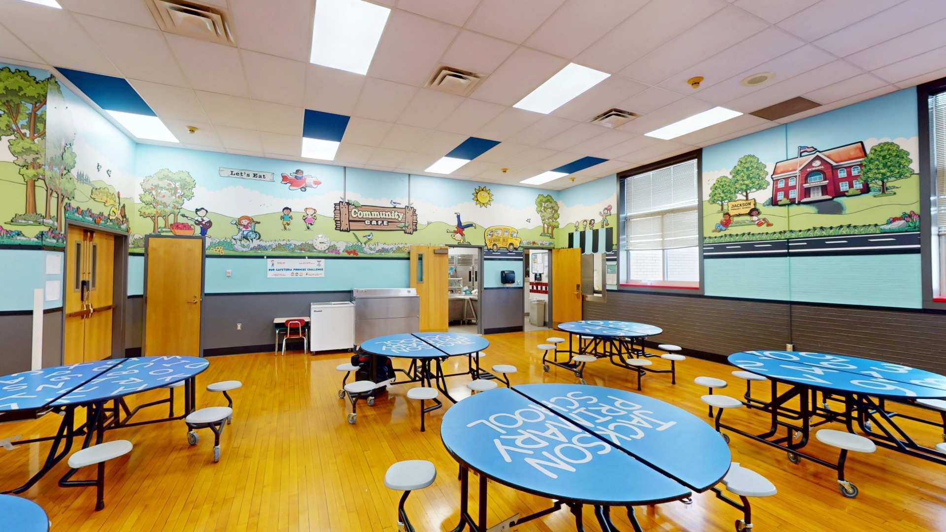
A menu students cannot read from the line is just decoration. Mind the font size, the contrast, the lighting, and the placement, and keep it from getting cluttered. Then let it look like your building. A board carrying the school colors and mascot reads as part of the cafeteria, not a notice taped over it, and that small thing changes how seriously students take it.
A good menu helps students say yes faster
Strip it down and that is the whole point. A good school menu makes the meal feel clear, appealing, and easy to choose, and it does that in the few seconds you actually have a student's attention. The programs that win participation are the ones that stopped treating the menu as a list to post and started treating it as the first thing that sells the meal.
--- FREQUENTLY ASKED QUESTIONS ---
What should a modern school menu include?
A modern school menu should be visual first: photos, clear categories, a few helpful icons, and short descriptions instead of a dense text grid. It should also exist in three connected formats, a monthly family menu, a daily cafeteria board, and serving-line signage, all readable from a distance and branded to the school.
How do you design a school menu that increases participation?
Design the school menu to be scanned in about five seconds. Show the food with photos, make categories obvious, and put the menu where the choice happens. Keep it current and branded to the building. A menu that is clear, appealing, and easy to read sells the meal before a student talks themselves out of it.
What are the new school nutrition standards for 2025 to 2026?
For the 2025 to 2026 school year, added-sugar limits took effect on items like breakfast cereal, yogurt, and flavored milk. A weekly added-sugar limit and lower sodium targets are scheduled to arrive in 2027 to 2028. A modern menu communicates these changes clearly without reading like a compliance document.
Should a school menu use icons?
Yes, but sparingly. A small, consistent set of icons, such as fruit, vegetable, grain, milk, vegetarian, local, student favorite, and new item, helps students read fast. The trap is using too many. A menu crowded with symbols nobody can interpret is worse than a plain one, so pick the handful that actually help students decide.
Where should a school menu be displayed?
A school menu should live in three places, each with a job. The monthly family-facing menu builds trust and helps parents plan at home. The daily cafeteria board sets expectations at the entrance. The serving-line signage guides the choice in the moment. Designed as one connected system, the three reinforce each other.