
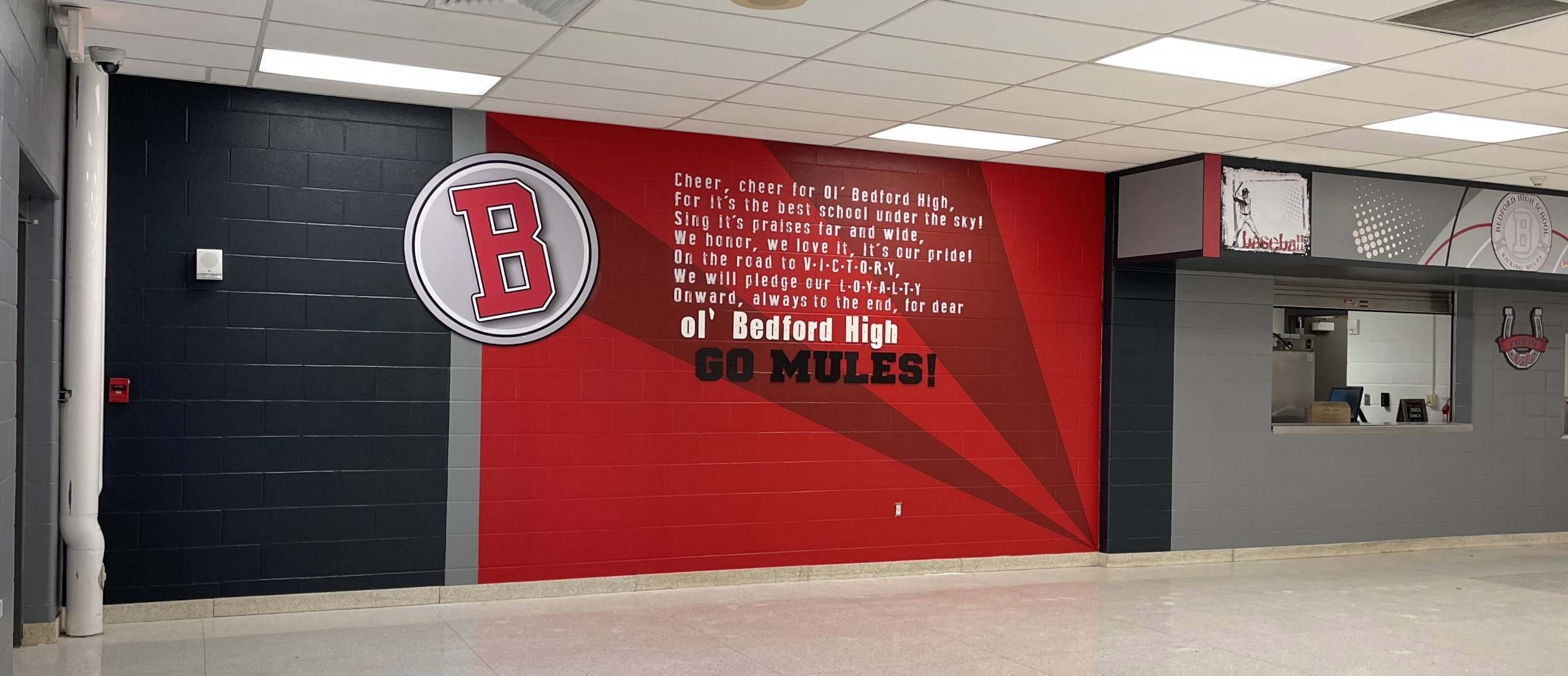
A mascot is not a graphic. It is the thing students stand under.
Picture a Friday night under the lights. The mascot is on the field and on the banners. It is on the spirit wear filling the stands, on the cafeteria wall everyone passed at lunch, on the gym floor the team has practiced on all season. Now picture the same week of graduation, the same mark on the program and the stage. A school icon turns up in more places, in front of more people, than almost any other piece of design a school owns.
That is exactly why it has to be strong enough to carry the weight. When the mark is done right, it stops being a graphic and becomes a symbol people care about. Students wear it. Athletes compete under it. Alumni remember it for decades. The community rallies around it. That is a lot of emotional work for one mark to do, and a weak one buckles under it.
Why does a school icon matter more in high school?
A school icon matters more in high school because high school identity runs deeper than it does in younger grades. It ties into athletics, alumni, community pride, traditions, rivalries, and a sense of belonging students carry long after they leave. Elementary and middle school logos matter too, but they rarely live in memory the same way.
It lives in memory in a way few other school graphics do. Get it right and it becomes part of how people describe where they are from.
What's the difference between a mascot, a logo, and a visual identity?
The mascot is the character or symbol. The logo is the designed mark. The visual identity is the full system: the colors, fonts, layouts, patterns, and the rules for how the mark gets applied across real spaces.
These three get used as if they mean the same thing. They do not. A great mascot with no system behind it still ends up looking different everywhere it lands, and that inconsistency reads as carelessness whether you mean it to or not.
How do you know when a school icon needs a refresh?
You can usually feel it before you can name it. A school icon has stopped pulling its weight when you start seeing signs like these:
- The mark shows up pixelated on a banner because the only file anyone could find was pulled off an old website.
- Athletics runs one version of the logo while the academic side quietly uses another.
- The mascot that felt right a decade ago now reads a little childish for a building full of teenagers.
- Staff cannot locate the correct file when they need it, so everyone improvises.
- Walk the campus and the icon looks slightly different on the wall, the uniforms, the signs, and social media.
None of it is a crisis on its own. Together it tells students the symbol is an afterthought, and they notice.
How do you modernize a mascot without upsetting the community?
You modernize a mascot by respecting the tradition while sharpening it, not by throwing it out and starting fresh. Bring students, coaches, alumni, and administrators in early. Keep the features people recognize and love. Then clean up the clarity, flexibility, and professionalism so the mark works as well on a gym wall as it does on a phone screen.
This is the part schools dread, and for good reason. People are attached to their mascot. Done with care, the community feels honored, not overruled.
What versions of a school icon does every campus need?
Every school needs a small kit of versions, not a single file, so the wall, the jersey, and the sign all stay in the family. One file cannot cover how the mark actually gets used across a campus. The kit that matches real use looks like this:
- Primary mascot mark. The full, detailed version that anchors the identity.
- Secondary mascot head or icon. A simplified version for small spaces and social avatars.
- Lettermark. The school's initials styled as a standalone mark.
- Wordmark. The school or team name set in the official type.
- One-color version. A clean single-color mark for uniforms, embroidery, and printing limits.
- Horizontal and vertical layouts. Both orientations so the mark fits wide banners and narrow signs alike.
- Spirit pattern or background graphic. A repeatable pattern for walls, spirit wear, and hype materials.
From a mark on the wall to an anchor
A school icon gets stronger when it stops standing alone. Put it next to your values, your traditions, your student achievements, and the spaces students gather in. A logo on a blank wall is decoration. The same mark woven into a pride wall that tells the school's story becomes an anchor, something students feel connected to instead of something they walk past. The icon should help carry the story, not just sit at the top of it.
What students actually remember
Students forget slogans. They forget the theme of the year and the wording on the banner in the front hall. What they remember is the symbol they stood under at graduation, the one stitched on the jersey, the one painted across the gym floor. That is the real work a school icon does, and it is worth the care it takes to get right. A mark that strong is not a line item on a budget. It is the thing a generation of students carries out the door with them.
--- FREQUENTLY ASKED QUESTIONS ---
What is a school icon?
A school icon is the symbol a school is known by, usually its mascot or logo, that represents the school's identity across jerseys, banners, signage, the gym floor, and graduation. It is the mark students stand under and carry with them after they leave, not just a graphic on a wall.
Why does a school icon matter so much?
A school icon matters because it appears in more places, in front of more people, than almost any other design a school owns. It carries athletics, alumni pride, traditions, and belonging, so a weak mark quietly undercuts all of it while a strong one becomes part of how people describe where they are from.
What's the difference between a mascot and a logo?
The mascot is the character or symbol itself, like a knight or an eagle. The logo is the designed mark built from it. Above both sits the visual identity: the colors, fonts, layouts, and rules that keep the mark consistent everywhere it appears, from the gym floor to a phone screen.
How often should a school update its icon?
There is no fixed schedule. Update a school icon when it stops pulling its weight: when files turn up pixelated, athletics and academics run different versions, the mascot reads childish for teenagers, or the mark looks different everywhere on campus. Refresh for those signs, not the calendar.
What file versions does a school icon need?
A school icon needs a small kit, not one file: a primary mascot mark, a secondary head or icon, a lettermark, a wordmark, a clean one-color version, horizontal and vertical layouts, and a spirit pattern. Together they keep the wall, the jersey, and the sign consistent.