
Simple does not mean boring. It means the room finally makes sense.
Here is the good news for anyone staring at a tight budget. A cafeteria does not need to look like a trendy restaurant to work better, and you do not need a full remodel to fix it. The changes that move the needle most are usually the simplest: clearer signs, a menu students can actually see, fewer visual distractions, real school pride on the walls, and a layout that quietly tells students what to do next.
A simple cafeteria can still feel bright, branded, and welcoming. The goal is not to fill every wall. The goal is to make the room easier, calmer, and more useful than it is today.
Start with the real problem, not the walls
Before you design anything, get honest about what the room actually needs to fix. Is the lunch line too slow? Are students confused about their choices? Is participation lower than it should be? Does the space feel institutional? Are staff repeating the same reminders all day? Does the menu get ignored? The answer points you straight at where the design should go, and saves you from spending on the parts that were already fine.
Treat the serving line like a storefront
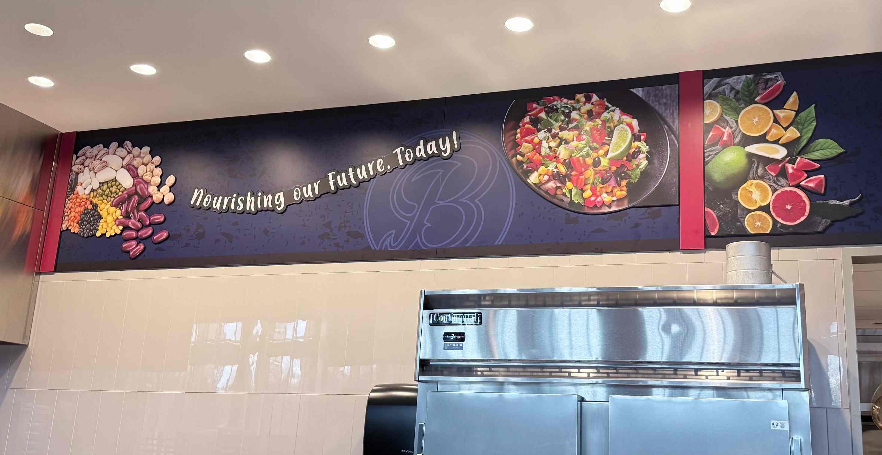
The serving line is where most of the confusion lives, so it is where simple design pays off fastest. The instinct is to scatter a few signs above the line and call it done. Try a different frame. Think of the servery entrance like a storefront. Give students a clear focal point to walk up to, hang branded graphics that draw the eye and quietly screen the back of house, and let the entrance read like a destination instead of a wall with a sign over it.
It is the same trick an airport uses. You walk a single concourse, but each little storefront feels like its own place because of how it is framed and lit. A servery can do the same thing. That framing makes the line feel intentional, easier to read, and a lot more inviting than a tray rail under fluorescent light.
Put information where the decision happens
A sign near the entrance might look nice, but if the actual choice happens at the serving line, the tray area, or the cashier, that is where the design has to do its job. Match the information to the moment. The menu belongs where students choose, not fifteen feet before they get there. And keep it to fewer words and clearer visuals, clean icons and real photos of the food rather than dense text, because a long rules poster does not get read in a moving line.
Break the room into zones
A space that reads as one big room feels chaotic. The same space broken into clear zones feels organized, even at peak rush. A simple set of zones covers most cafeterias:
- Entry and welcome area
- Menu area
- Serving line
- Condiment and milk area
- Seating area
- Trash and recycling
- Exit path
Let school pride carry a simple cafeteria
You do not need wall-to-wall graphics to make a room feel cared for. A mascot graphic, the school colors, and a line of mission language do an enormous amount of work without crowding the space. Pride tells students the room was built for them, and that alone changes how it feels to eat there. The same goes for the practical pieces. Even a whiteboard does not have to be the boring institutional kind. Built and branded well, it becomes a fun, flexible part of the room instead of an afterthought.
Low-lift upgrades that punch above their cost
If you want a starting menu of changes that deliver more than they cost, these are the reliable ones:
- A branded menu board. The day's choices shown where students actually decide.
- A mascot wall. Instant school pride that signals the room was built for them.
- Fruit and vegetable icons. Quick visual nudges toward the healthier picks.
- Tray return signage. Clear cues that cut staff reminders at cleanup.
- Table zone graphics. Visual order that calms a busy seating area.
- A cafeteria expectations wall. Behavior norms posted right where they happen.
- A simple wall mural. One focal piece that makes the space feel cared for.
- Grab-and-go breakfast signage. Faster mornings and easier participation.
Where should you start with a simple cafeteria?
Start by stripping away the noise, because that is the whole job. A simple cafeteria works when students can tell what to do without being told, and you can get there without a construction budget or a summer-long project. If you want a place to begin, pick the one wall students look at most and fix that. The rest of the room tends to rise to the standard you set on the first surface you take seriously.
--- FREQUENTLY ASKED QUESTIONS ---
What is a simple cafeteria design?
A simple cafeteria design uses clear signs, a visible menu, defined zones, and a few branded touches to make the room easy to read, instead of a full remodel. The aim is a space that tells students what to do next, so it feels calmer and more useful without crowding every wall.
How can I improve my cafeteria on a tight budget?
Improve a cafeteria on a tight budget by fixing the cues, not the construction. A branded menu board, a mascot wall, fruit and vegetable icons, and clear tray return signage cost little and pay off fast. Start with the one wall students look at most and build from there.
How do you speed up a slow lunch line?
Speed up a slow lunch line by framing the servery like a storefront and putting information where the choice actually happens. Give students a clear focal point, show the menu at the serving line rather than at the entrance, and use clean icons and food photos instead of dense text.
What cafeteria changes increase meal participation?
Participation rises when the room is easy and inviting. Show the menu where students choose, use fruit and vegetable icons to nudge healthier picks, add school pride so the space feels built for them, and remove friction at the line. A clearer, calmer room gets more students through it.
Where should a cafeteria redesign start?
Start with the real problem, not the walls. Name what the room needs to fix, whether that is a slow line, low participation, or an institutional feel, then design for that. Pick the single wall students look at most and take it seriously. The rest of the room rises to that standard.